Teas & Herbal Blends, Online Tea Store
2022, UX writing course (UX Writing Hub)

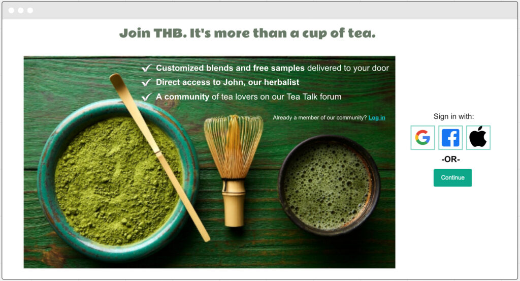
When I started my user research, I named the fictional website “LT”. I thought it was a nice play on the words ‘healthy’ and ‘tea’, but when I got feedback on my research report from my mentor, I realized it wasn’t quite working as I had intended it to. She was perplexed as to what LT stood for (“loose tea?”), and as much as I found it amusing, it wasn’t funny. Obviously, the name had to be changed. Not only that, the research pointed me in a different direction than what I had initially planned for the website: I thought the main focus of LT, and the thing that would make it stand out as a tea website, would be the founding herbalist who offers personalized medicinal blends. The research, however, clearly showed that people are not particularly interested in this product, surely not to a degree that justifies prominently displaying it as the main value proposition. So, I changed “LT – Your personal blend of natural wellness” into “THB – Teas & Herbal Blends to nourish your body and your mind”.
User Journey
THB offers two main services on its website:
1. Purchasing teas and herbal blends and having them delivered to your door.
2. Consulting with an herbalist and getting personalized infusions delivered to your door.
Here are these two user journeys.


Mini Content Style Guide
Based on the findings of the user research, I created this style guide for the THB UX writing team.
A/B Testing
Based on the responses of the participants in the A/B testing, I changed the layout of the homepage and rephrased some of the content to make the user experience smoother and more aligned with the preferences and priorities of the target audience.


Copy Doc
I believe research is the only justification for any decision I make as a UX writer.
Sure, there may be other reasons behind the decision-making process (the company’s objectives, marketing goals, development and design considerations), but the findings of the user research and A/B testing, combined with a deep understanding of what users need and expect from the product, as well as what they love and enjoy about it, are my main drivers as a UX writer deciding what content to use and how to display it on the site.
One thing I learned from my research was that my product’s potential users are tea connoisseurs who pay attention to nuances like the difference between real tea (made from the tea plant camellia sinensis) and herbal blends (which cannot really be called ‘tea’, because there’s no tea plant in them). This minor terminology issue, I thought, could go a long way in convincing my target audience that this is a website created by people who know their tea. And their herbal blends.


