Meditation App
2022, UX writing course (UX Writing Hub)

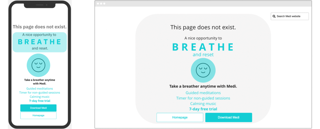
This 404 page has two purposes: informing the user that they’ve clicked a broken link, but also encouraging them to download the Medi meditation app or visit the homepage.
I’d suggest to the designer that the illustration at the center of the page be slightly animated, inflating and deflating, to simulate breathing. As it sits right under the word ‘breathe’ in all caps, it will add some visual interest and a relaxing effect that might nudge users to check out the app (assuming that they landed on this 404 page because they are already interested in practicing meditation).
Search bar on desktop version – given that much of the traffic to this page probably comes from broken links on various forums and social media platforms, I’m assuming that users are trying to get to a particular page that has specific information they’re looking for. I’m therefore giving them the option of searching the website for what they’re interested in (a specific meditation session, pricing information, About page, etc.)
The mobile design does not include a search bar because of the smaller screen and the need to prioritize much more mercilessly.


