Website Builder
2022, UX writing course (UX Writing Hub)
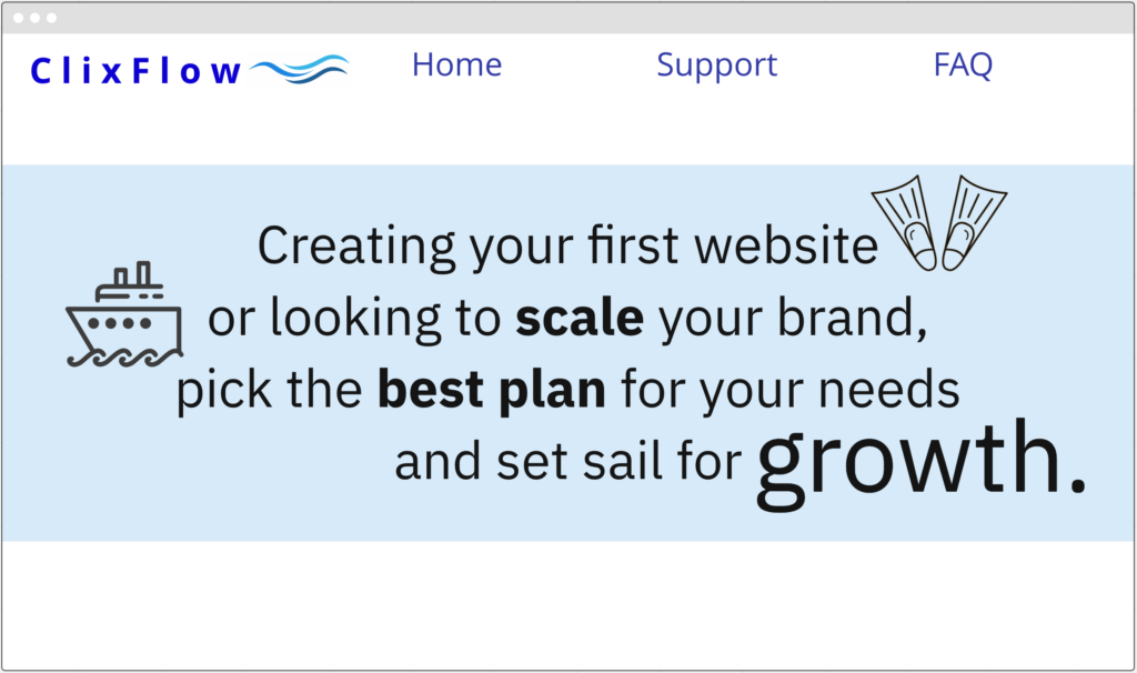
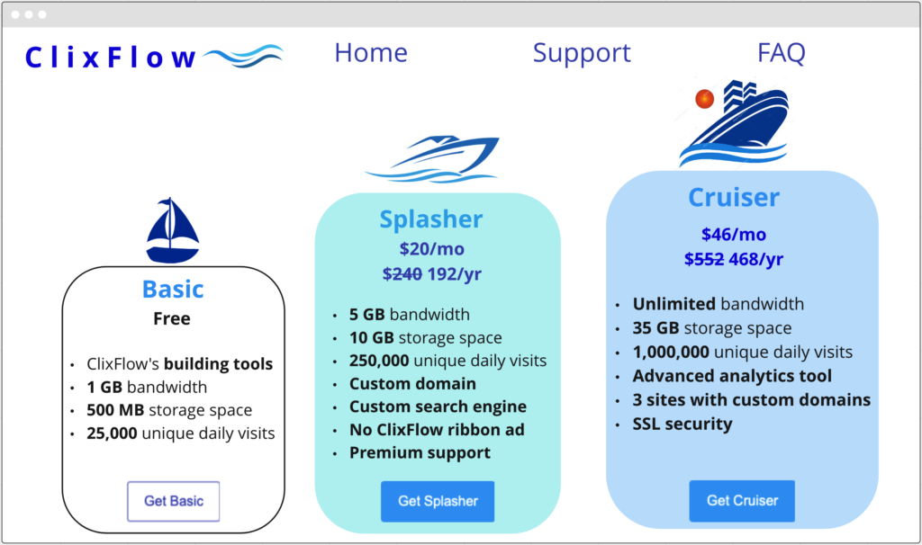
This page is divided into two parts – a short introduction, followed by the details of the different plans as the user scrolls down. This pricing page has two purposes:
1. Provide the user with information. I wanted to keep it as simple and easy-to-absorb as possible, while stressing that different customers need different plans, highlighting the fact that ClixFlow can provide the right plan for every stage in a business’s development, and clearly showing the differences between the plans to account for the different price levels.
2. Get the user to sign up to a plan. Even if they choose the free plan, it still involves a certain level of commitment and allows ClixFlow to establish a relationship with them that can eventually lead to them becoming regular paying customers.
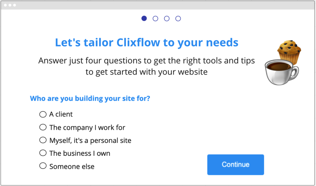
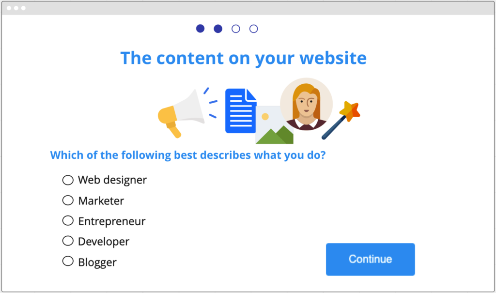
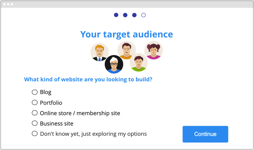
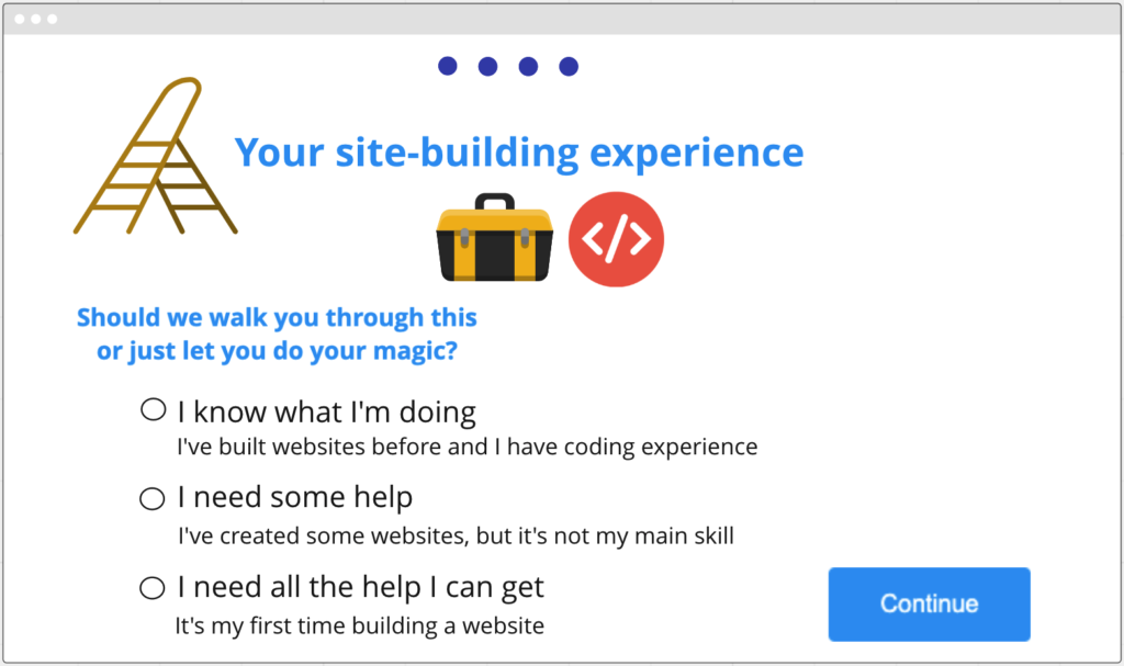
After the user chooses a plan, they are directed to the Sign Up form: four short, simple questions that will help match them with the right templates and guidance for their specific needs and skill level.
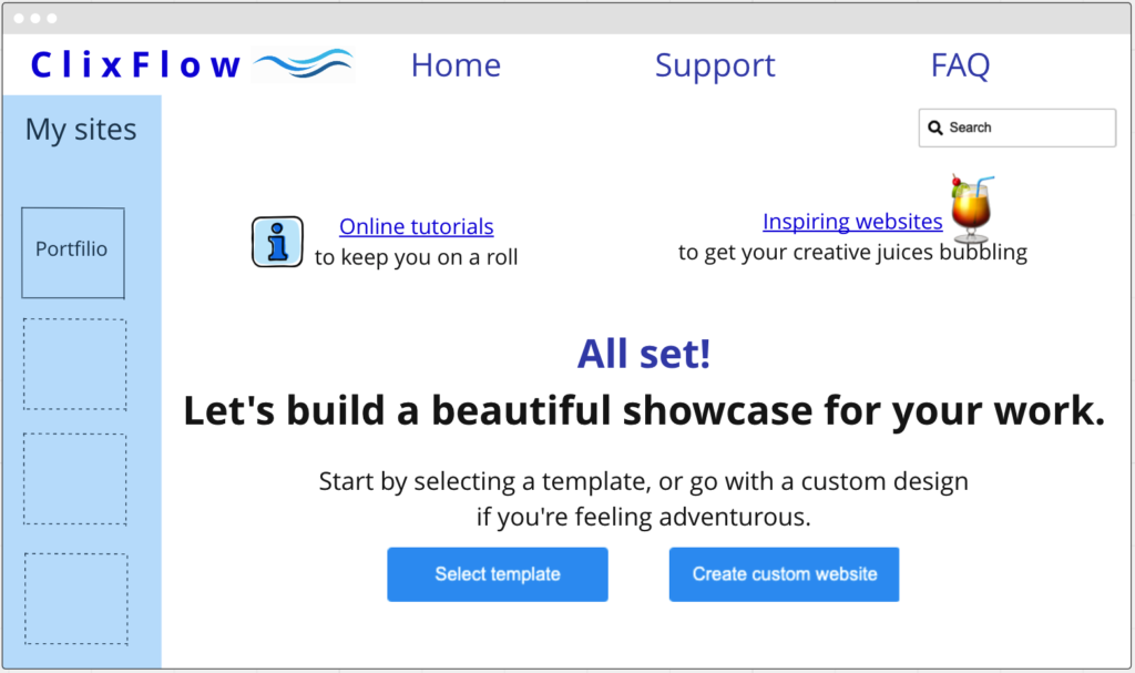
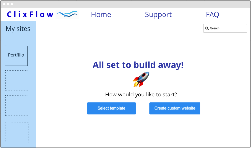
Finally, the user reaches an empty state where the text matches their skill level – one version for beginners, and one for experienced website designers.
Building a website can be daunting for a beginner, so the purpose of the text on the beginner empty state (left) is to “ease the user into” this project, reassuring them that they can find all the help they need on the ClixFlow website and offering some inspiration to unlock their creativity. Users with more experience need less guidance and encouragement, so the second empty state is much shorter.
